
Bar Graphs | Creating, Reading, and Interpreting
- Math Lessons >
- Bar Graphs
Overview of Bar Graphs | Creating, Reading, and Interpreting:
A pictorial representation of data is far easier to understand, interpret, and compare than a raw or disorderly data collection. A bar graph is one such representation. In this lesson, we'll learn to create, read, and interpret bar graphs. Let's get into gear!
What Are Bar Graphs?
A bar graph, also known as a bar chart, is a graph used to show and organize the distinct categories of data. It represents data using rectangular bars drawn with reference to the categories and values displayed. Here's a bar graph that represents the favorite snack items of 10 children. Catch a glimpse!
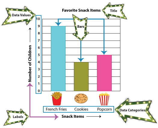
Note: The rectangular bars have equal widths, and they are separated by equal distances.
How to Create Bar Graphs
Now that we know what a bar graph is, let's learn to make a bar graph for a specific data. Let's get rolling with our first example!
Ms. Jenkins is planning to take her class on a field trip. She is looking for suggestions.
Some kids opted for the aquarium, while some wanted to visit the zoo animals. More interesting yet, there were some others who thought the museum was the best idea.

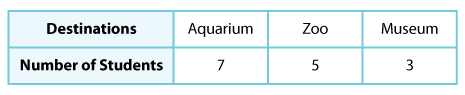
So to decide on the field-trip destination, Ms. Jenkins asked the 15 kids to choose between the aquarium, zoo, and museum. The students' choices are as shown.
How do you think Ms. Jenkins would convert the information into a bar graph? Well, here is how!
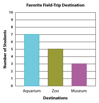
As you can see, the title of our bar graph is "Favorite Field-Trip Destination". Along the vertical line, we have the number of students, and along the horizontal line, we have the three destination choices.
Now the bar graph makes it easy for Ms. Jenkins to compare the children's responses and decide where to take them.
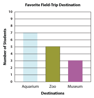
However, there's something you might be curious about. Why should we not have the number of students along the horizontal line and the three destination choices along the vertical line? You asked it right! A bar graph made this way is also correct, and here we have it illustrated for you.
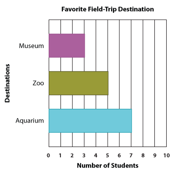
Since now you know both the types of a bar graph, the vertical bar graph and horizontal bar graph, are equally good, you are free to choose between the two when creating your own bar graphs.
How to Read and Interpret Bar Graphs
Let's answer a few questions based on the bar graph we just created.
1. How many kids chose the aquarium?
To answer this question, spot the bar representing the aquarium, and identify the number the top of this bar aligns with. In this case, there were seven kids who chose the aquarium.
2. How many kids opted for the zoo?
You're right! Five students opted for the zoo.
3. And how many wanted to go to the museum?
Good going! We have three museum lovers.
4. Which was more popular: the museum or the aquarium?
To answer this question, you need to study the two bars shown below.
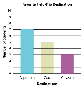
Which is taller? The aquarium, which means the aquarium was more popular than the museum.
5. What was more preferred: the zoo or the museum?
Let's look at these two bars more closely.
Which is taller? The zoo. So, we know the zoo was more popular than the museum.
6. Which destination was the most popular?
Comparing the heights of the three bars, we can see the aquarium has the tallest bar. So, it's clear that Ms. Jenkins would take her class to the aquarium.
Let's look at another example.
Example
The bar graph below illustrates the students' choices of the aquatic animals they were most hopeful of seeing at the aquarium.
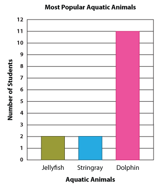
Read the graph and answer the following questions.
1. Which aquatic animal bagged the highest number of votes?
Going by the graph, we can say that the dolphin has won hands down!
2. Which aquatic animal was less popular: the stingray or the jellyfish?
If you said stingray, that would be wrong. And if you said jellyfish, that would still be wrong because both the stingray and jellyfish have equal numbers of votes. So, neither of the options answers the question.
3. How many votes did the stingray and jellyfish get?
The stingray and jellyfish got 2 votes each.
4. How many liked dolphins?
Give yourself a pat on the back if you said 11.
What Are Scaled Bar Graphs?
Imagine Ms. Jenkins is doing this voting among students of grades 1 to 5 of a school. Let's assume there were 200 students.
Will she still be able to show the students' choices in a bar graph?
This is where a scaled bar graph comes to our rescue!
We use scaled bar graphs to represent a large amount of data. The different categories and values are depicted on their horizontal and vertical axes. Here is an interesting example.
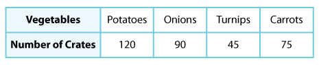
A truck carries several crates of potatoes, onions, turnips, and carrots to deliver to the supermarkets in a city. The table illustrates the number of crates carrying each vegetable.
Before converting the information into a bar graph, you need to understand that the bar graphs we created earlier were all based on a single unit scale, and now we are going to increase the scale to accommodate each value.
In order for our graph to fit in all the data values, we need to decide on the most feasible scale. In this case, we have chosen the greatest common factor of the data values, i.e., 15. With the scale 1 unit = 15 crates, our bar graph for this scenario will be:
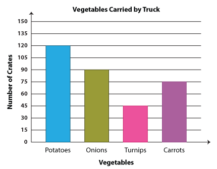
Note: You can scale the graph by 3 units, 5 units, 10 units, etc., as per your convenience.
That's how you create scaled bar graphs. Time for questions!
1. How many more crates of potatoes than onions were delivered?
The difference between the number of potato crates and onion crates will give us the answer. So, that would be 120 crates − 90 crates = 30 crates.
2. How many crates of carrots and potatoes were there altogether?
You're right! We need to add the number of carrot and potato crates; so we have 75 crates + 120 crates = 195 crates.
3. There were twice as many crates that contained onions as those that had turnips. Is this statement true or false?
Let's convert this into a math statement.
90 crates = 2 x 45 crates
As two times 45 crates is also 90 crates, the statement is true.
4. How many more crates of carrots than turnips were delivered?
Whenever the question asks us to find a difference, the thumb rule is to subtract. So in this case, 75 crates − 45 crates = 30 crates, which is our answer.
5. How many crates of veggies were delivered in all?
To answer the fifth question, you need to sum up the number of crates containing each vegetable. So we go 120 + 90 + 45 + 75, and we get 330. Now we know 330 crates of veggies were delivered in all.
It's Your Turn Now!
1. Make a bar graph using the data below.
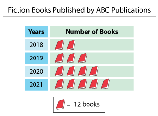
Below is the bar graph that shows the number of books published by ABC Publications:
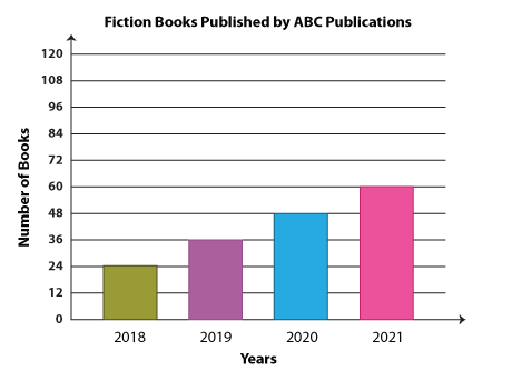
Note: You can also make a horizontal bar graph using the given data as stated earlier, and the scale can also vary.
2. Mrs. Wright conducted a survey to find out which musical instruments her students were the keenest to take lessons on. The bar graph below displays her findings.
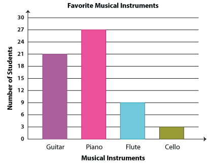
Go through the graph and answer the questions.
1. How many fewer children voted for flute than guitar?
2. Which musical instrument tops the chart of preferences after the piano?
3. How many children were interested in playing the cello?
1. 12 children
2. The guitar comes next to piano in the chart of preferences.
3. There were three children who were eager to start playing the cello.
Double Bar Graphs
We have learnt to display a set of data on the bar graph and compare the data values within that set. But, can we display two data sets on the same graph? Can we compare two data groups? Yes, we can if we know how to create a double bar graph!
A double bar graph has all the features of a bar graph, including the axes, titles, etc., except that there are two bars for each category. Let's explain with an example.
Daisy compares the costs of a variety of pizzas at Dominos and Pizza Hut.
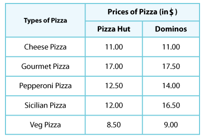
Now, let's convert this into a double bar graph. Here's how it looks.
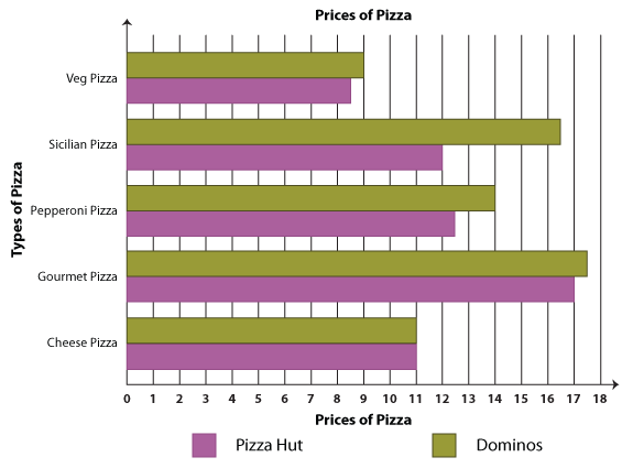
Experience the ease of comparison when you have a double bar graph at your service. Shall We Interpret?
1. Which pizza costs the same at both Dominos and Pizza Hut?
You're right! It's the cheese pizza.
2. Which pizza costs the most?
Locate the tallest bar, and here we have gourmet pizza.
3. What is the difference between the prices of pepperoni pizza and Sicilian pizza at Pizza Hut?
The difference between the rates is $ 12.50 − $ 12.00 = $ 0.50; the rates differ by 50 cents.
4.How much more does Dominos charge for its veg pizza?
The difference is $ 9.00 − $ 8.50 = $ 0.50. The difference is 50 cents again.
5. Which pizza stands out by having the biggest price difference of all? What is the difference?
To answer this question, we need to study the deviation in each pair of bars. The item with the most price difference is Sicilian pizza and the difference is $ 16.50 − $ 12.00 = $ 4.50.
A Quick Recap
Bar graphs provide a pictorial representation of several categories of data.
The different parts of a bar graph include the title, axes labels, data categories, data values, and bars.
Once we've collected the data values for each category, we can represent them on a horizontal or vertical bar graph.
To read and interpret a bar graph so created, we need to examine each part carefully. The bars are the centerpiece that shows us the number of data values in each category.
For larger data values, we can use a scaled bar graph.
Comparison of two different data values pertaining to the same category is done using a double bar graph.

Scale up your practice with our free printable Bar Graph worksheets!